Wednesday, 17 December 2008

First attempt at animation...


This is my first attempt at animation...
I did this a few months ago, by drawing each of the frames in photoshop and importing them into iMovie. Took ages to do, but I was pretty chuffed when I finished it so thought I'd share it...

Sunday, 14 December 2008

Problem?

Due to illness I missed Friday's session where we were put into groups of common themes/ideas and so I ended up in a group who had researched texture...Felt a bit bad that none of my *movement* research could be put into use but don't think it made too much of a difference. The task was to identify a problem in Leeds to do with our theme...
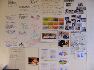
We ended up deciding that the texture of some foods put people off eating them and linked this with the idea of people not getting their 5/day. We did a survey, asking people around the college, to find out whether this was a genuine problem and a total of 26 people agreed that they were put off by some fruits due to their textures and so our problem solving began...
After a week of pestering people to fill in questionnaires (Primary research) we gained a lot of quantitative data which helped us make decisions on how to get people to eat more fruit...our solution was to make people aware of the different textures of fruit available...i.e. dried fruit, fruit bars, juice etc...
The method of making people aware of these options consisted of what Hannah likes to call *the fruity booty*....basically a fruit stall giving away free samples. We did the *pilot* in college, and depending on the success the aim would be to have more spread across the nation!


The primary research we gathered over the week...


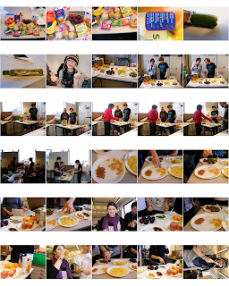
Contact sheet Hannah put together showing the fruit stall in action...*click to enlarge*
One of the things that proved very useful during this research brief was actually interpreting the research we'd gathered. It was handy to collate the data and represent it visually so instead of having to read through everything we could see the data immediately.
Although the questionnaires proved useful and we did manage to get some qualitative answers from them, if there was anything interesting on them we couldn't ask more in depth questions from peoples answers...and so interviews would probably be an interesting way of collecting more general opinions and questionnaires could be used for the more specific answers.
5 things I would do differently:
- Use different ways of collecting primary research other than surveys and questionnaires
- Ask more people from the general public rather than those who are around in the studio
- Look at how other people have tried to solve a similar problem
- Involve the general public more in the whole process
- Decide on what people are doing straight away, make it clear and keep communication up during the whole week

5 things I have learnt about the design process:
- Using research effectively ensures that a solution is appropriate to your target audience
- The more you can find out about the problem the better the results are
- Research isn't just reading/surfing the net, it can be practical too
- By experimenting with ideas straight away you can learn from them and develop ideas even more
- Working with other people you can guarantee you'll never end up with an idea you would have chosen on your own

Movement...

...after categorizing our 100 photo's we got back into our groups of 4 and looked at each others photos. We had to think about different themes that each of us could research into, taken from our collection of photos.
The themes that were suggested to me included;
Night-time photography of close objects
Gates
Transport
Movement
Cropped bodies
Found type
Glasses
Fences
Texture
Padlocks

....from the title of this *blog* you can probably guess that I chose "Movement". I was immediately interested in ways that I could represent movement through still image, especially how I could do this photographically.


This image shows the movement of light from a flame...
I used a long exposure time to show the development between the start and end of the photograph. After experimenting in this way I spent a lot of time trying to work out how to photograph the movement of a person.
This proved quite difficult. If the person moved too fast you could barely make out they were there...I think this is probably due to there not being enough contrast between them and the background. Maybe if I were to photograph them in the studio using all white as a background and them in black it could work?


This is one of the images I tried to show one particular movement, compositionally it's not great but I was more bothered about the technique rather than anything else...


...and here is one of the images where I have tried to show movement through stages. To be able to pick up this amount of figures I had to use several flashes. Again the image isn't very strong, but it's a starting point...

Visual Language...

...using crafting to represent words.


These two images represent the word *reflect*. The exercise made us all think about the words and their meanings and how we can communicate that without words. It was hard to do but there were some interesting results from it...

Sunday, 7 December 2008

4/100

During reading week we were asked to document the following things through photography;
People, Type, Places, Textures, and Objects.
100 of which we needed to select and present.


- Object & Texture -


- People - (sort of)


- People -


- Type & Texture -

Wednesday, 3 December 2008

Healthy eating...

...here's an image that one of my friends on the photography course - Dan Ross - has produced, looking at peoples attitude to healthy eating. The message is clear and communicated in a clever and ironic way. Thought people who looked at healthy eating for the last brief might be interested in it.

Sunday, 23 November 2008

No news is still good news...

Continuing with the same message as the previous brief - that creativity is needed in advertising - meant that yet again I was making life difficult for myself. The mailshot brief required reproducing 10 of the mail shots...so obviously being a sucker for punishment I decided to hand craft all mine.
The idea I went with was "Put creativity back into advertising" and experimented with how that could be done physically...I ended up creating a logo and removing the word creativity. I made the mail shots interactive so that it was the target audience who had to put "creativity back into advertising"...showing that it was them that had the power to do it.


Pretty pleased with aspects of my work on this one. There's still a lot that needs to be improved with it but time was a bit of an issue...again.

Monday, 17 November 2008

Lukes Typeface....

After taking about an hour a letter I have FINALLY finished the typeface for Luke on illustrator...


One of my new favourite designers....


Been meaning to post this for a while now but just been reminded by an article in Computer Arts about using craft work in Graphic Design. In the last few months I've been making more use of 3D in my work and been asked about it. I couldn't really explain why I liked using crafts but there were a couple of interesting interviews which basically said that maybe using craft work and 3D was a reaction to the rise of the more linear work and almost "anti-technology".
Anyway...the reason for this post was just to show a few bits of work that I'd been shown recently which maybe other people might be interested in too...


These two images are from designer - Julien Vallee...
His work seems to have a real life to it and almost demands attention.

Another image that has interested me recently is something most people have probably already seen but I wanted to include it anyway. Its an image called "The Magic Machine" and was a competition winner for "Don't Panic".


There's also a video that you can watch which shows how they put the installation together...


Feeling a bit sketchy...

Just a quick upload of a sketch I did of Liam (Rep) while he was watching the elections a week or so ago...don't think I've actually managed to do any proper drawing since May/June so am hoping I'll be able to get back into that soon...

Sunday, 9 November 2008

No news is good news...


For this brief I chose the quote "Adverts are terrible things". After researching the topic and talking to people about their views on adverts I've come to the conclusion that with a bit of innovation adverts can actually be very entertaining and enjoyable...it's those that lack in the creativity department which justify the mentioned quotation. So...for my brief I decided to aim my posters at those producing advertisements with the message, put creativity into advertising.


"Stop hiding potential"

The coloured type represents the possibilities that advertising provides...the brown represents the prevention of this, with the hands signifying possible clients stopping advertisers from producing something original.


"Creativity is waiting to burst out"

This image shows a box which acts as a metaphor for trying to control creativity, and hands which are ripping it open to let the *creativity* out. The hands are important as it shows that it is down to the target audience to allow creativity to be free and it is them that can let it happen.


"From creativity comes originality"

This image works on the idea that from the creativity that is let out of the box comes original ideas. The type was made from wire and took ages...I'm not too sure if it was worth it but I don't think anyone else made their letters from wire so at least it is original...

As I was discussing with Jo I made this brief a lot harder for myself than I needed to...trying to communicate a message which put enormous pressure on my own work. I'm not sure how well I've answered the brief to be honest...at least this is another lesson learnt...

metaphors, metonyms and synecdoche....

ok so I completely forgot about this until I was reminded about it approximately 5 minutes ago...also because I am so organised I can't get my hands on that sheet and any definitions I can find on the internet seem as though they have been written by people who have literally swallowed a dictionary. what i'm saying is...i'll sort this out tomorrow when i'm in a better state of mind. until then here's one image i've found which acts as a metaphor for the future of a marriage. the well recognised wedding cake is symbolic of the relationship between the couple and the fact it is split in half signifies the predicted seperation. it's quite a cynical image come to think of it...i quite like it though.


Right so...a metaphor is...something that isn't necessarily anything to do with what is being represented but is symbolic of it or is associated with it. In this example cake doesn't really have anything to do with a relationship but it is understood that the split is symbolic of what will happen to the couple....

A visual synecdoche is a part that represents a whole.


Here these two hands represent two different people. The hand is only a body part, but we know that it belongs to a person without it having to be shown.

A visual metonym is an image which is symbolic of a subject. The image and subject are related however not exclusively.


Because of the context you may associate these rings with marriage and the commitment that they represent. The fact that the rings are interlinked also represents a "joining together" which supports the idea of a relationship. Although rings are symbolic of this, they are not exclusively for this purpose. The can also be worn as an accessory.


Tuesday, 4 November 2008

Roll it, print it, clean it, repeat...

...the makings of a successful print workshop.
Mono printing was actually not bad at all. Even though the main purpose of the day was to experiment with the technique I think most of us got a few images we were pretty pleased with. Bit disappointing that the colours weren't as vibrant once printed than on the actual boards but the texture of the print probably made up for that.


Screen printing was next to come, and although it was a pretty interesting day - with a lot of team effort - I wasn't too impressed with the work I produced that day.


Learnt how to use the print room now though so hopefully I'll be able to pop back at some point and produce some decent images...

Monday, 3 November 2008

What is violet...?

Knowing the answer to that question would've made this brief a whole lot easier. Working on the theory that we're supposed to be making mistakes I'd say I did pretty well on this project...
For starters I didn't get involved in the whole *thought process* for a few days and then when I did I think I managed to spend a good 9 hours "polishing a turd"...that's one shiny turd.
Anyway...with one day to go I finally decided on how I could approach this brief. Rather than pick one idea of what violet is I thought I'd try and convey the different connotations of the colour. Ambitiously I tried to create the images using 3D crafts, I think this could've worked if I'd started a bit earlier on in the week but unfortunately I didn't - which meant I only managed to present 7 of the series. Soz!

Collecting objects...

To launch us into colour theory we were asked to collect 10 objects of our *chosen* colour. By chosen I obviously don't mean we actually got to pick our colour...it was more of a random selection. My colour was purple/violet...depending on how you're feeling.
In groups we experimented with different ways we could organise our objects in order of colour. One of the ways we presented them was by making use of our pigeon holes...starting with the violets verging on blue, working our way through the lighter shades and ending on the violets which were starting to merge into red...


We watched the *blues* intently line up their objects from light to dark...which ended in a colour very close to violet. We thought it would be interesting to add our objects onto the end and before we had finished everyone seemed to be getting involved. The result was a huge loop which took over both the corridor and the studio - attracting a lot of attention. I think it's fair to say everyone was pretty impressed with the result and is a good example of what collaboration can achieve...


Tuesday, 28 October 2008

Lukes design for me...


This is the typeface that Luke designed for me. I like that he looked at typefaces that I had mentioned as an influence. The type is quite fun and after hearing some of the decisions Luke made while designing it, it's also very cleverly done...the badge works particularly well (modelled beautifully below). I think that the lower case possibly reflects the words better than the upper-case as the badge shows. The fact that Luke added "+Kevin" onto the badge (my invisible friend when I was younger) made me laugh...

Designing Lukes typeface...

Looking at the words I had to illustrate all I could think of was Times New Roman, and so I used this as a starting point. I decided to take a technical approach to the design and based it around technical drawings. This, I hope, reflects the idea of being careful and particular.


After our interim crit I decided I would alter the positioning of the letters on the A1 poster to represent the idea of being well travelled. Using arrows to do this also meant that there was a barrier between the letters, as though the letters were quite "guarded".


Because of the nature of the design (carefully and technically drawn letters) the typeface has taken a stupid amount of time to produce. Unfortunately it's still not quite finished but here's what I presented at the Crit anyway....

Knowing me and knowing you....ahaaa...

To get us "in the mood" for this new brief we were sat down and showed a video - where different typefaces were personified. The aim of which was to show us that type could (and does) have a personality. The video was actually quite funny and I had a moment of realization half way through where I thought "Oh god, I'm laughing at type jokes. I am officially a geek."

After that we were given some questions to answer about ourselves and asked to write 10 more questions to ask somebody else. Armed with our Q&A we were paired up and began to interrogate one another. I was paired with Luke (Hallam).
We had a chat about what we had written down and got to know each other a bit more...which resulted in us decided on 10 words to describe each other.

Lukes words ended up being -
Careful
Fun
Mature (x2)
Particular
Genuine
Trustworthy
Well Travelled
Intelligent
Conservative (which after asking Luke what he meant I altered to "Guarded")

The brief was to design a typeface for our partner which demonstrated these words.

Monday, 20 October 2008

Just because I like to repeat myself....

...thought I'd re-post the entries that I had on my other "blog"...

Saturday, 4 October 2008

I've told you a million times not to exaggerate....

This week we had fun looking at the alphabet. Each of us picked a word out of "the randomizer" which determined our fate for the next few days. I was pretty chuffed with my word to begin with...exaggerate...thinking that it fitted my personality quite well. However, after sitting down for 10 minutes and thinking about it I felt like hurting somebody, and seriously resented that box. After speaking to my friend about the brief I decided to do one of the things I do best - lie. I took a pen and a piece of paper and started to write about the letter "E"...needless to say everything I wrote down was either a complete lie altogether or a blatant exaggeration. I began to incorporate the text within some of the images I had been putting together and suddenly started enjoying the brief a lot more.

I think one of the most important th ings I have discovered this week is that the better results come from when I am actually enjoying myself, and the more I put off work the more I hate it. So I have come to the decision that if I just kick myself into gear I'm going to get a lot more out of everything. This theory applies to this "blogging" malarkey as well...and so instead of spending ages worrying about what I'm going to write I'm just going to write it. No doubt this will result in a lot of rubbish...but I'm not the one that's going to be reading it...
Anyway...as well as the "exaggerate" brief we were given a task which involved hunting shapes down around the college. The shapes were decid ed by picking them out of my new best friend "the randomizer"...and I ended up with hexagons and squares. Cheers for that! After a mad hunt everyone came back and displayed their treasure on the wall...it was a pretty impressive sight seeing all the shapes up on the wall together and everyone seemed surprised how good it looked.

We also had some fun with stamps that day...and experimented with making type using the two shapes that were given to us. I don't think I am the only one who can say they still have ink in between all their nails but it's probably worth it for what we got out of the exercise.

One thing I will say about the briefs we've been given this week is that they've made me realize how much people's responses to them vary - it's mental! I've become a bit of a wanderer over the last few day's looking at everyone's work and getting very distracted! Some of it is shown below...
All in all - despite the long hours slaving away and averaging about 3 hours a sleep a night - I've had a pretty good week...so thanks everyone!

Sunday, 28 September 2008

Looking at type...


I've been looking through some of the work from some of the designers we were shown on Friday hoping for some inspiration...
Two of the examples in particular really stood out. One of which is the series of images produced by Jack Featherstone called "Play with type".

It's obvious from the series of images that are shown on his blog - playwithtype.blogspot.com - that experimenting with type in this way was genuinely enjoyable.
For some reason this seems to make the work a lot more interesting. Perhaps because the images reflect the designers enthusiasm.
The other example was an image from Apeloig, called "The P.O.S.T.E.R.".

Again, what makes this image interesting for me is sense of playfulness within the piece. I like the idea
of using paper and text to create type, which is something I haven't seen very often. It seems like a very simple idea but I think that it's the simplicity of it which makes it work so well.
(I will include more images to this soon but at the moment am having trouble with formatting...)

Thursday, 25 September 2008

Getting started...

Unfortunately for whoever is reading this, this is the first "blog" I've ever written. No doubt it will be pretty tedious and so - unless falling asleep at your computer is part of your plans for today - you might want to give this one a miss. In fact...I think I might too.
Sunday, 19 October 2008

At last...

...I've finally managed to create a new account!
After many strops/hissy fits etc...I'm back on the "blogging" scene. (Insert collective cheer)
I'll re-post the gems that were my first posts soon enough, fingers crossed this blog won't be as temperamental as the last...