http://www.e-price0811.blogspot.com
Wednesday, 19 August 2009
Monday, 29 June 2009
Tuesday, 5 May 2009
Manifesto - reflecting on myself as a designer
What I used to be:
I first gained an interest in Art and Design after a piece of homework where we had to draw a selection of objects inside a matchbox. Concentrating on that really relaxed me, and getting probably the only praise I ever had throughout high school for it made my enthusiasm for drawing grow further. From that point I tried to use drawing as much as possible within my body of work. The approach during my high school education to Art and Design was very much image focussed, encouraging us to use painting and drawing and take inspiration from other artists. Concept and problem solving wasn't really mentioned within these lessons.
Assessments required us to show examples of "computer manipulation" which nobody understood. It resulted in the majority of us using generic filters on photo's and printing out, just days before the hand in date.
During sixth form I began to look at a lot of illustration for inspiration and it was at this point I actually tried to use software to help develop my work. I was determined though that I would only use the software to help try out different ideas and edit work that I had already hand produced. I felt that by keeping this hand drawn element the work was a lot more personal and less sterile.
Studying a foundation course at college was probably the best thing I could have done. For the first time I was actually taught how to use different materials and introduced to things like 3D and printmaking. I began to craft and produce animations, but also started to think more about design within a context and asked my tutors to give me very specific briefs to take on with tighter deadlines to try and prepare myself for this course.
Still being on an Art and Design course meant that the main priority for people was aesthetics, and so the meaning and clarity of some of my work probably got lost on the way.
Where I am now:
Since being on this course I have had to try and think a lot more about the message behind my work and how well it is communicated. To begin with the problems I chose to solve were very general or very difficult to try and communicate. I also tended to make things a lot harder for myself than I needed to.
Identifying a problem and making it specific and concise is a lot easier for me now. Doing this really helps when thinking around the problem and how to solve it appropriately. Actually giving my work a purpose is a lot different to how I've been used to working but I think it helps drive the ideas a lot further.
Somehow I've managed to get myself a reputation as a "crafter" but to be honest craft is just something I wanted to try out and I find it easier to work with materials then try and muster up patience for a computer. I do enjoy crafting things, and a lot of the designers that interest me deal with 3D - in particular installations and 3D type. I'm a bit annoyed with myself that I haven't done more drawing though, as this has always been one of my strengths. It was towards the end of the Visual Language module when I realised how much I actually missed it and I'm so disappointed that I didn't make more of that opportunity to get drawing again.
Where I intend to be in 2nd year:
From this point there are a number of things I want/need to do. Firstly, I have to make my work more clear and "not let my cleverness get in the way". I tend to over complicate things some times which reduces the clarity of the resolutions.
Also I think I've been avoiding using software too much, to the point that I'm not confident in using it at all. My work would probably benefit from me learning how to use it especially when it comes to presenting it in a professional way and finishing it well.
I need to start evaluating my work a lot more as I go along. When I'm actually told to do it, it really helps me understand why I am doing what I'm doing, and gives me a chance to think about problems I need to address. It's such a useful thing for me to do and yet I never think to do it.
Wednesday, 29 April 2009
Friday, 24 April 2009
Yusuke Saitoh
Thursday, 9 April 2009
Some drawing...

I've been promising my friend Nikki for almost 2 years to draw her and her daughter...this slightly more relaxed time "off" has meant I have finally been able to do it. Unfortunately I'm not too happy with the quality of it. There's certain parts of this drawing that make me want to rip it up. But that's the usual effect drawing has on me. Especially drawing something you know so well. I think it's the eyes that are really winding me up. Yeah, it definitely is.
Pixelgarten...
Here's just a few examples of their commissioned and personal work. For anyone interested I've put the link to their website on the right.
A quick thank you to Liam as well, for being patient on no sleep and teaching me how to make an animated gif.
Tuesday, 31 March 2009
You are a line.

It was tricky working out what context to put my drawings in for this brief. The drawings were designed to reveal the subject/image by having light behind it. I thought about maybe producing something for a window in a public place, such as a cafe but I felt as though I was really trying to force a context onto a piece of work. The whole meaning of this selection of drawings is that it isn't posed, it isn't forced, it's simply an observation of people in their natural environment doing whatever it is they were doing before I decided to watch them. Which made me come to the conclusion that this solution should be just that. A way of documenting who is about, working in the studio at the same time I am. I haven't been able to draw everybody in the class which is disappointing, it would've been quite nice to have something with everyone on.
After talking to Amber I decided to photograph the drawings over a lightbox, this meant that the revelation still came through due to light, but also there were less restrictions on the format of the final work.
At first I was going to display the drawings in a grid which showed 5 drawings from each day. It was difficult to manage doing 5 every day due to timetabling/group work and so I kept the grid idea but didn't assign the drawings to days/a time.

****click to enlarge****
The final grid...its actual size is 550 x 550
It's been printed onto self adhesive paper so it can be stuck wherever or can be cut into stickers...
Pretty pleased with it, but now I want to do more drawing!!!!
Wednesday, 11 March 2009
Statement of intent...what is a line...
After experimenting 3 different strands of *what is a line?* I have decided on one particular focus.
I am now using continuous line drawings to record people. It is important that the people aren't in posed positions but instead are continuing to do whatever they were doing before I started to draw them. I am going to continue to try and show their slight movements by layering these drawings over one another. This way the development over time can be seen.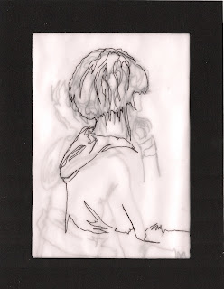
All my previous experience of drawing has consisted of drawing something for a long period of time. With this method of drawing I am able to draw the figures more freely. By drawing them repeatedly I am learning to actually *see* the shapes that make up the figures more clearly and I have found that the drawings that are produced later on are of much better quality.
Wednesday, 4 March 2009
New Blog...
...http://emmaprice-designpractise.blogspot.com/
Most updates from ougd104 module will be on there from now on...
Most updates from ougd104 module will be on there from now on...
Tuesday, 3 March 2009
Puzzled...
...I chose to attempt the *Recognition Day* brief. My target audience was people who found it difficult to say *thank you* and so I began to think about who these people were and how I could help them. I decided that it would be interesting to make the postcards interactive as a way of helping. After our crits which discussed our intial ideas I decided to develop the idea of using puzzles...
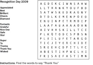
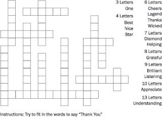
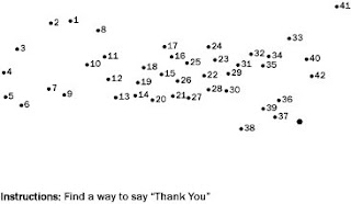
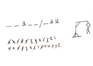
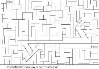
...each of the puzzles were accompanied with a tagline which referred to both the nature of *recognition day* and the puzzle itself.
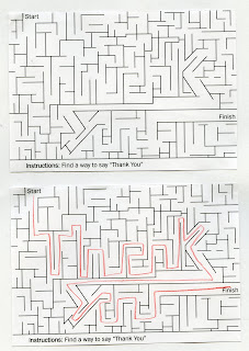
For the final upload I chose to scan in a copy of the blank maze and one filled in.


...each of the puzzles were accompanied with a tagline which referred to both the nature of *recognition day* and the puzzle itself.

For the final upload I chose to scan in a copy of the blank maze and one filled in.
Sunday, 22 February 2009
"Fly by Night - The New Art of the Club Flyer" - Craig McCarthy...
...a book I've had on my bookshelf for about 3 months with the intention of uploading a couple of images. The book displays a number of club flyers which are quite countertypical. The flyers deal more with hand drawn, mixed media and collage. Anyway, there were a couple of pages that caught my eye months ago and it's about time to share...
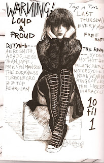
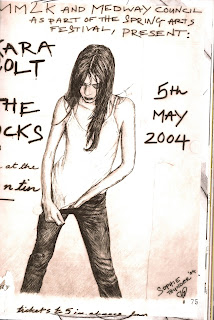
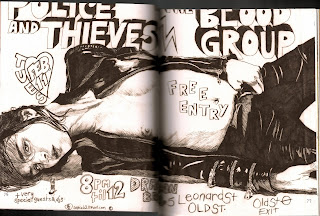
...these are all examples of work from the same person - Sophie Thunder.
Saturday, 21 February 2009
What is a line...? iii
Seeing as everyone seems to be looking at animation for this I started to think maybe I didn't want to approach it in the same way. So I began to experiment with different ways a line could be used to indicate boundaries. I then thought about using line to indicate negative space and couldn't help myself. I wanted to see what it would look like in motion. SO. I took some photo's of my fingers *walking* and then began to mark the negative space using line. It took AGES. and my camera *malfunctioned* halfway through taking shots so the movement is limited. Still I think you can see what I was aiming for...
...the music to the video is none other than *Walk the Line - Johnny Cash*.
...the music to the video is none other than *Walk the Line - Johnny Cash*.
Sunday, 15 February 2009
Birthday card for jaclyne...
Thursday, 12 February 2009
End of Module Self Evaluation
1. What practical skills have you developed through this module and how effectively do you think you have applied them?
During this module I have learnt how to bind a book using the perfect bound method. Unfortunately I do not think that my final book is as well bound as I had hoped it would be, which has meant the quality of the whole selection of work has been reduced.
I have also been trying to use photography a lot during this module, and have tried to learn how to use light when capturing the image.
2. What approaches to/methods of problem solving have you developed and how have they informed your design development process?
Research has been the main focus for this module. By identifying things I have needed to know and then actually finding out about them has aided me during problem solving a lot. Rather than just making presumptions about what the target audience would want I have actually attempted to find out, ensuring that what I produce is something that people would be interested in. During the research process, I have managed to find out other things that I had not thought of previously and so the research has then inspired further ideas.
3. What strengths can you identify in your work and how have/will you capitalise on these?
The research I have been able to collect has been useful and what I have found out has been applied to my work. This is something I must continue to do. Previous to this module I hadn’t used photography a lot, however I think that some of the photographs I have taken have worked really well and have really helped communicate the ideas I have try to portray.
4. What weaknesses can you identify in your work and how will you address these more fully?
Actually putting the book together has not been as successful as I had hoped. I think precision is a problem of mine and I need to be more considered about measurements. I spent a lot of time re-printing things due to wrong sizes and this is something I need to take more care over. The work I have produced using mainly software is nowhere near as successful as other work and so I need to put some time aside to practise using software more for when I need it, so that I can produce more professional looking work.
5. Identify five things that you will do differently next time and what do you expect to gain from doing these?
1. Keep all my digital files organised properly and backed up, so I am not worrying about where my work is or coming into college without necessary work.
2. Document what I have been doing photographically, in particular for group work. So that I have a record of what I have done.
3. Take more care over measurements, so I am not re-printing work and to relieve me of extra stress.
4. File each project as it ends, to save myself time at the end of the module.
5. Print this evaluation out and keep it in sight so I know what mistakes to avoid and what I am supposed to be doing to help myself.
6.How would you grade yourself on the following areas:
5= excellent, 4 = very good, 3 = good, 2 = average, 1 = poor
1 2 3 4 5
Attendance 4
Punctuality 4
Motivation 4
Commitment 4
Quantity of work produced 4
Quality of work produced 3
Contribution to the group 4
Tuesday, 10 February 2009
Artists/Designers people may be interested in...
...following the advice of my crit group last week I had a flick through *Hand to Eye* for illustrators who dealt with line.
3 illustrators in particular stood out, so here's some of their work...
Lucinda Rogers - "Documentary Drawing From Life"
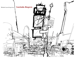
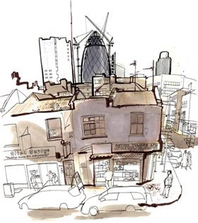
The variation of thickness of the lines in these images is something to consider.
Seb Jarnot - "Free and Figurative"
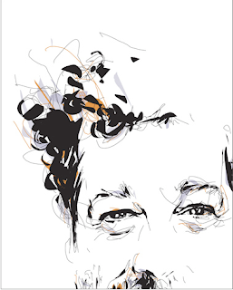
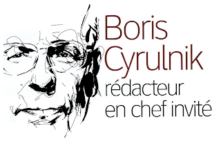
Really like these, think the fact that they are figurative is the thing that interests me most, so maybe I'm going along the wrong track by thinking of objects...maybe I should start to look at people instead.
Lizzie Finn - "Hand made in a digital sort of way and graphic in a crafty sort of way"
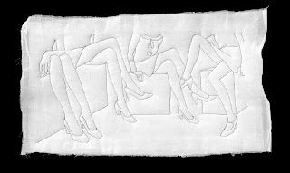
Really liked the illustrations in *Hand to Eye* but can't find any decent ones online...
3 illustrators in particular stood out, so here's some of their work...
Lucinda Rogers - "Documentary Drawing From Life"


The variation of thickness of the lines in these images is something to consider.
Seb Jarnot - "Free and Figurative"


Really like these, think the fact that they are figurative is the thing that interests me most, so maybe I'm going along the wrong track by thinking of objects...maybe I should start to look at people instead.
Lizzie Finn - "Hand made in a digital sort of way and graphic in a crafty sort of way"

Really liked the illustrations in *Hand to Eye* but can't find any decent ones online...
What is a line...? ii
An example of animation that uses mainly line to communicate the story. I like the interaction between the animator and the work, for example the way the hands are used to extend the lines etc
Some really nice ideas executed, it's quite long though. So if you have chance have a gander.
Some really nice ideas executed, it's quite long though. So if you have chance have a gander.
Saturday, 7 February 2009
Construction/Destruction...
Thursday, 5 February 2009
What is a line...?
______________________
For this brief I am investigating the idea that a line is "A mark indicating position, connection or boundaries". I began to look at the development of lines in the form of continuous line drawings and plan to continue with this idea, and approaching it using animation.
I know that this is what I want to focus on however choosing a subject to demonstrate this idea has been a problem for me. At the moment, it is possible that I will be looking at a series of objects which are all connected somehow, whether it's to do with the nature of the object or whether they are necessary for a particular *event*.
Monday, 2 February 2009
Doug...
...tried to screen print a bit from *Doug* the childrens TV programme but am having problems so here's the video instead....
...basically I think it's an interesting way of considering the addition of line, within an animation itself. For this brief animation is a strong possibility for a response and so this seemed quite relevant.
...basically I think it's an interesting way of considering the addition of line, within an animation itself. For this brief animation is a strong possibility for a response and so this seemed quite relevant.
Wednesday, 28 January 2009
Monday, 26 January 2009
32 page book...
...so this project stressed me out. a lot.
I decided to categorize the cars depending on what their purpose/use was and present them in appropriate ways according to this. Some of these worked well and am developing them for the final book...others made me feel physically sick to put my name to them.
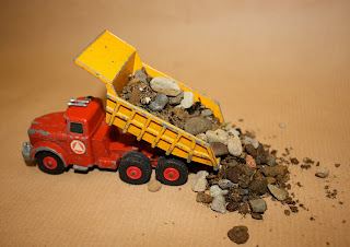
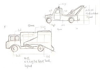
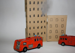
The most successful pages were those that showed the toys actually being played with. I think my main problem was not deciding who I was aiming the book at. I didn't want it to be about collecting cars and I didn't want it to be aimed at children either. Lorenzo suggested that I aimed it at people who used to play with toy cars, which is the ideal audience.
So now the plan is to show through imagery how the toys would have been played with, and create a more personal feel to the book. More of a *nostalgic* approach. Hopefully I can do it justice...
I decided to categorize the cars depending on what their purpose/use was and present them in appropriate ways according to this. Some of these worked well and am developing them for the final book...others made me feel physically sick to put my name to them.


The most successful pages were those that showed the toys actually being played with. I think my main problem was not deciding who I was aiming the book at. I didn't want it to be about collecting cars and I didn't want it to be aimed at children either. Lorenzo suggested that I aimed it at people who used to play with toy cars, which is the ideal audience.
So now the plan is to show through imagery how the toys would have been played with, and create a more personal feel to the book. More of a *nostalgic* approach. Hopefully I can do it justice...
Wednesday, 14 January 2009
Statement of intent...
...the focus of the book we are to produce will be toy cars. I am yet to decide on the actual title of the book, I think that it will probably be chosen during the development of my work over the next couple of weeks.
There are two obvious ways that this subject matter could deal with; the idea of collecting the *models* and the systematic way that they can be categorized or perhaps the theme of *toys* which opens the possibilities of creating stories/scenario's as someone would if playing with them...
At the moment I find the *toys* approach more interesting. I've already collected information about what the toys are based on, but I think I need to research the kind of environments the real life cars would be expected to be found in/their use.
I am also intending on having a look at other books which deal with the same subject, and find out how they have approached it.
To help develop my ideas I am likely to use a mixture of methods, including drawings, photography, and possibly crafting. The use of software to combine these elements will help produce final images.
Using craft to make sets for the cars may be appropriate as it is something that is done often when playing with the toy cars.
Throughout the process I will be using photography to document my progress and worksheets/sketchbooks to record different ideas. I will be referring to the given brief to ensure I am meeting the requirements and hopefully feedback from the group will help test the solution throughout different stages.
Tuesday, 13 January 2009
Open day poster...
...while I was back in Rugby I visited my old college and saw a really good poster advertising an open day. The type was made by using the kind of tubes used in hamster cages. Unfortunately I can't seem to find the image online anywhere but while I was looking for it I came across this image which is quite interesting.
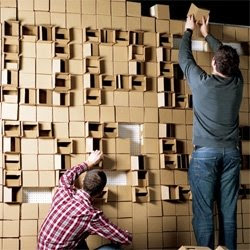
The type here has been made by opening boxes (I think) to reveal shadow and the contrast between this and the other boxes.

The type here has been made by opening boxes (I think) to reveal shadow and the contrast between this and the other boxes.
Book binding...

actually loved this. probably because I got to be crafty for the day.
sort of guide as how we made it;
- took 9 pieces of paper and grouped them into 3 sections
- folded the paper in half
- stacked the sections and sewed them around strips of material ensuring it was tightly pulled
- put pva glue down the spine, in layers, filling in the gaps
- pva a strip of material along the spine
- measure and cut card for the front and back cover and spine
- wrap the card in the textured material
- use the front and back paper to attach the cover to the book with pva glue
I realise they aren't the most comprehensive of instructions but it's enough to remind me of the process...
A morning in the studio...

...some shots we took during our studio session in photography. Interesting how just changing the lighting can effect the whole atmosphere of the image.


...thanks to the amazing modelling skills of my group, we got a few good pictures. AND I actually enjoyed the session, which is a turn up for the books as previously I had a bit of a grudge against photography. The more I'm learning about it, the more I'm wanting to experiment with it. I think my main problem before was having a lack of patience and not understanding why I couldn't get pictures to look the way I wanted straight away. Because I have found it challenging though, when things do work out alright it's more rewarding.
Sunday, 11 January 2009
What is a book?
In my opinion the most important thing about a book is engaging the reader/audience. So to answer *what is a book* I've decided to include examples of books that have interested me in particular...
...the first of which is a book I used to read as a child called *The Jolly Christmas Postman*
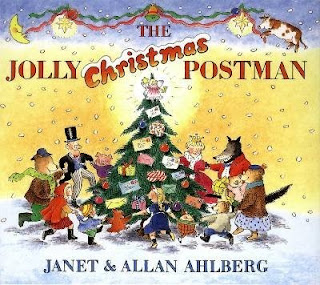
This book is actually amazing. It tells the story of a postman and his journey at christmas time...what made this book so good though was the amount of interactivity available. The highlight of which was a letter box at the end, you could pull this out (a bit like an accordian) and see all the characters in 3D.
...the second book in this entry is one that Amber showed us. Everybody has probably seen this one already now and I think it was a pretty popular one.
the fact that it got everyone talking is a sign of it's success. The main reason people seemed to like it was because it was so different...taking *pop up* to the next level, and fully making use of the *series* opportunity that a book gives you.
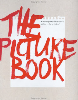
As you can probably guess from the cover, this book deals with pictures! Mainly illustrators work, with small bits of information about the artist/designer/picture maker. This kind of book is particularly useful as a resource for particular audiences.
Books need a target audience, a running theme, content, a cover, and to be a physical object. Of course you can get web books etc etc but one of the best things about a book is being able to touch it and flick through the pages.
The idea of a series/sequence is obviously an important aspect...and the relationship between the pages or how you get from one page to another. I used to have one book which the character travelled through the book in a hot air balloon through slots in the pages. Again, it's that interactivity with the reader which made me remember this book.
...the first of which is a book I used to read as a child called *The Jolly Christmas Postman*

This book is actually amazing. It tells the story of a postman and his journey at christmas time...what made this book so good though was the amount of interactivity available. The highlight of which was a letter box at the end, you could pull this out (a bit like an accordian) and see all the characters in 3D.
...the second book in this entry is one that Amber showed us. Everybody has probably seen this one already now and I think it was a pretty popular one.
the fact that it got everyone talking is a sign of it's success. The main reason people seemed to like it was because it was so different...taking *pop up* to the next level, and fully making use of the *series* opportunity that a book gives you.

As you can probably guess from the cover, this book deals with pictures! Mainly illustrators work, with small bits of information about the artist/designer/picture maker. This kind of book is particularly useful as a resource for particular audiences.
Books need a target audience, a running theme, content, a cover, and to be a physical object. Of course you can get web books etc etc but one of the best things about a book is being able to touch it and flick through the pages.
The idea of a series/sequence is obviously an important aspect...and the relationship between the pages or how you get from one page to another. I used to have one book which the character travelled through the book in a hot air balloon through slots in the pages. Again, it's that interactivity with the reader which made me remember this book.
Friday, 9 January 2009
Lines.
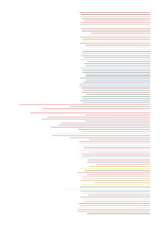
So basically I've measured the length of every toy car and represented that length by drawing a line. The colour of which has been chosen by the colour of the toy car...
...so just 100 lines then.
Tuesday, 6 January 2009
100 toy cars...
These are the toy cars I have collected for the brief 100. Some of them are actually amazing but unfortunately I'm having trouble with my camera and have left the receipt in Leeds so can't get it sorted out yet. Which means the quality of these photo's isn't brilliant.
Wednesday, 17 December 2008
First attempt at animation...
This is my first attempt at animation...
I did this a few months ago, by drawing each of the frames in photoshop and importing them into iMovie. Took ages to do, but I was pretty chuffed when I finished it so thought I'd share it...
I did this a few months ago, by drawing each of the frames in photoshop and importing them into iMovie. Took ages to do, but I was pretty chuffed when I finished it so thought I'd share it...
Sunday, 14 December 2008
Problem?
Due to illness I missed Friday's session where we were put into groups of common themes/ideas and so I ended up in a group who had researched texture...Felt a bit bad that none of my *movement* research could be put into use but don't think it made too much of a difference. The task was to identify a problem in Leeds to do with our theme...
We ended up deciding that the texture of some foods put people off eating them and linked this with the idea of people not getting their 5/day. We did a survey, asking people around the college, to find out whether this was a genuine problem and a total of 26 people agreed that they were put off by some fruits due to their textures and so our problem solving began...
After a week of pestering people to fill in questionnaires (Primary research) we gained a lot of quantitative data which helped us make decisions on how to get people to eat more fruit...our solution was to make people aware of the different textures of fruit available...i.e. dried fruit, fruit bars, juice etc...
The method of making people aware of these options consisted of what Hannah likes to call *the fruity booty*....basically a fruit stall giving away free samples. We did the *pilot* in college, and depending on the success the aim would be to have more spread across the nation!
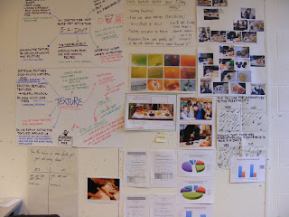
The primary research we gathered over the week...
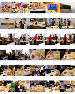
Contact sheet Hannah put together showing the fruit stall in action...*click to enlarge*
One of the things that proved very useful during this research brief was actually interpreting the research we'd gathered. It was handy to collate the data and represent it visually so instead of having to read through everything we could see the data immediately.
Although the questionnaires proved useful and we did manage to get some qualitative answers from them, if there was anything interesting on them we couldn't ask more in depth questions from peoples answers...and so interviews would probably be an interesting way of collecting more general opinions and questionnaires could be used for the more specific answers.
5 things I would do differently:
- Use different ways of collecting primary research other than surveys and questionnaires
- Ask more people from the general public rather than those who are around in the studio
- Look at how other people have tried to solve a similar problem
- Involve the general public more in the whole process
- Decide on what people are doing straight away, make it clear and keep communication up during the whole week
5 things I have learnt about the design process:
- Using research effectively ensures that a solution is appropriate to your target audience
- The more you can find out about the problem the better the results are
- Research isn't just reading/surfing the net, it can be practical too
- By experimenting with ideas straight away you can learn from them and develop ideas even more
- Working with other people you can guarantee you'll never end up with an idea you would have chosen on your own
We ended up deciding that the texture of some foods put people off eating them and linked this with the idea of people not getting their 5/day. We did a survey, asking people around the college, to find out whether this was a genuine problem and a total of 26 people agreed that they were put off by some fruits due to their textures and so our problem solving began...
After a week of pestering people to fill in questionnaires (Primary research) we gained a lot of quantitative data which helped us make decisions on how to get people to eat more fruit...our solution was to make people aware of the different textures of fruit available...i.e. dried fruit, fruit bars, juice etc...
The method of making people aware of these options consisted of what Hannah likes to call *the fruity booty*....basically a fruit stall giving away free samples. We did the *pilot* in college, and depending on the success the aim would be to have more spread across the nation!

The primary research we gathered over the week...

Contact sheet Hannah put together showing the fruit stall in action...*click to enlarge*
One of the things that proved very useful during this research brief was actually interpreting the research we'd gathered. It was handy to collate the data and represent it visually so instead of having to read through everything we could see the data immediately.
Although the questionnaires proved useful and we did manage to get some qualitative answers from them, if there was anything interesting on them we couldn't ask more in depth questions from peoples answers...and so interviews would probably be an interesting way of collecting more general opinions and questionnaires could be used for the more specific answers.
5 things I would do differently:
- Use different ways of collecting primary research other than surveys and questionnaires
- Ask more people from the general public rather than those who are around in the studio
- Look at how other people have tried to solve a similar problem
- Involve the general public more in the whole process
- Decide on what people are doing straight away, make it clear and keep communication up during the whole week
5 things I have learnt about the design process:
- Using research effectively ensures that a solution is appropriate to your target audience
- The more you can find out about the problem the better the results are
- Research isn't just reading/surfing the net, it can be practical too
- By experimenting with ideas straight away you can learn from them and develop ideas even more
- Working with other people you can guarantee you'll never end up with an idea you would have chosen on your own
Subscribe to:
Comments (Atom)


